Freedom Copper
Building a brand around
what copper makes possible.
- Client
- Freedom CopperA copper exploration company focused on unlocking the potential of copper resources to power the industries and infrastructure.
- Project
- Corporate BrandA distinctive new name and brand identity connecting the potential beneath the earth with the freedom and progress copper makes possible.
- Services
- Brand & Digital
- Brand Strategy & Positioning
- Messaging
- Visual Identity Design
- Brand Guidelines & Visual System
Freedom Copper needed more than a mining-company identity.
It needed a name and visual system capable of expressing the scale of the opportunity, the character of the land and the role copper plays in enabling a more independent, electrified future.
We built the brand from that idea outward.
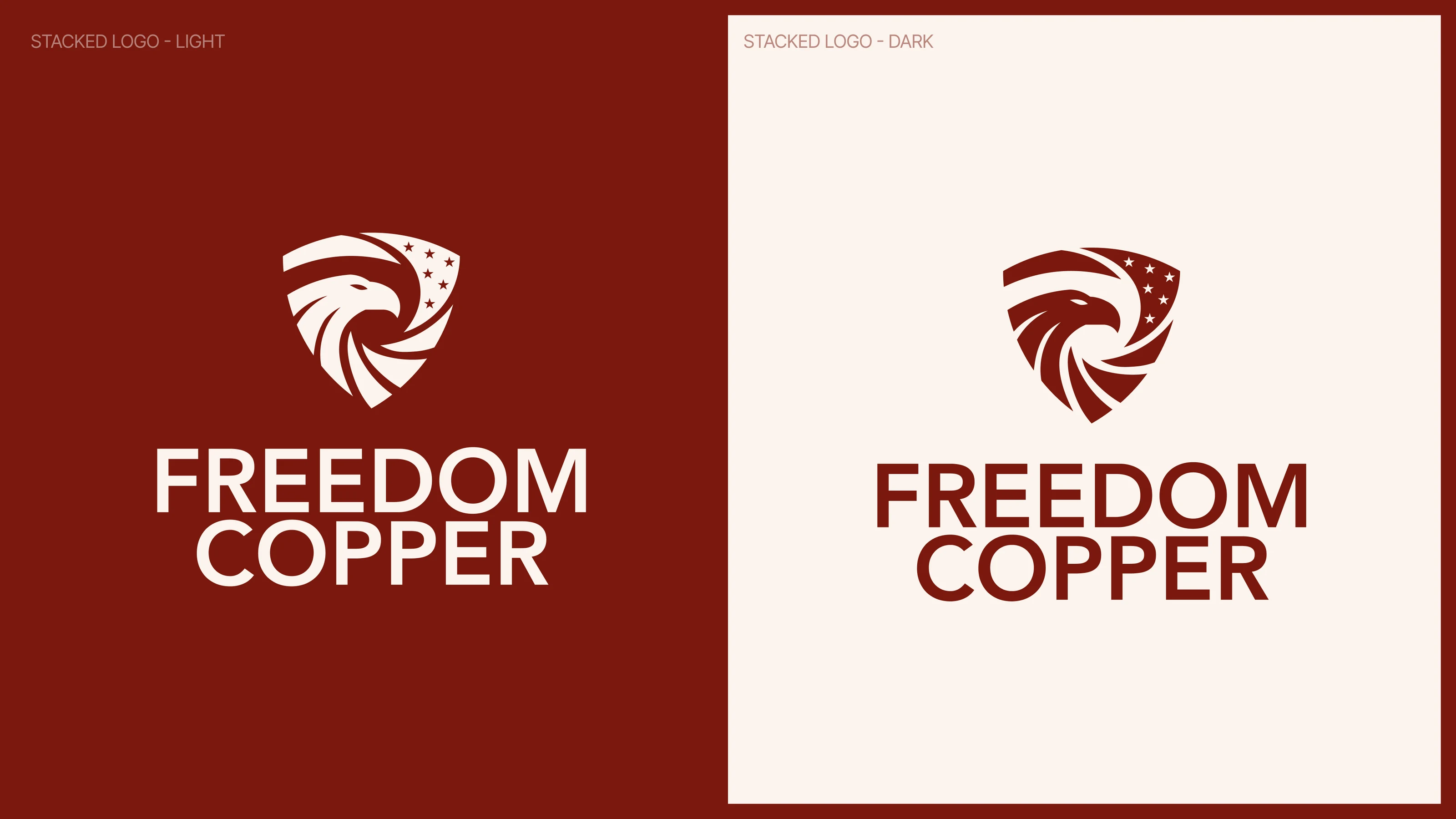
(01) Logomark
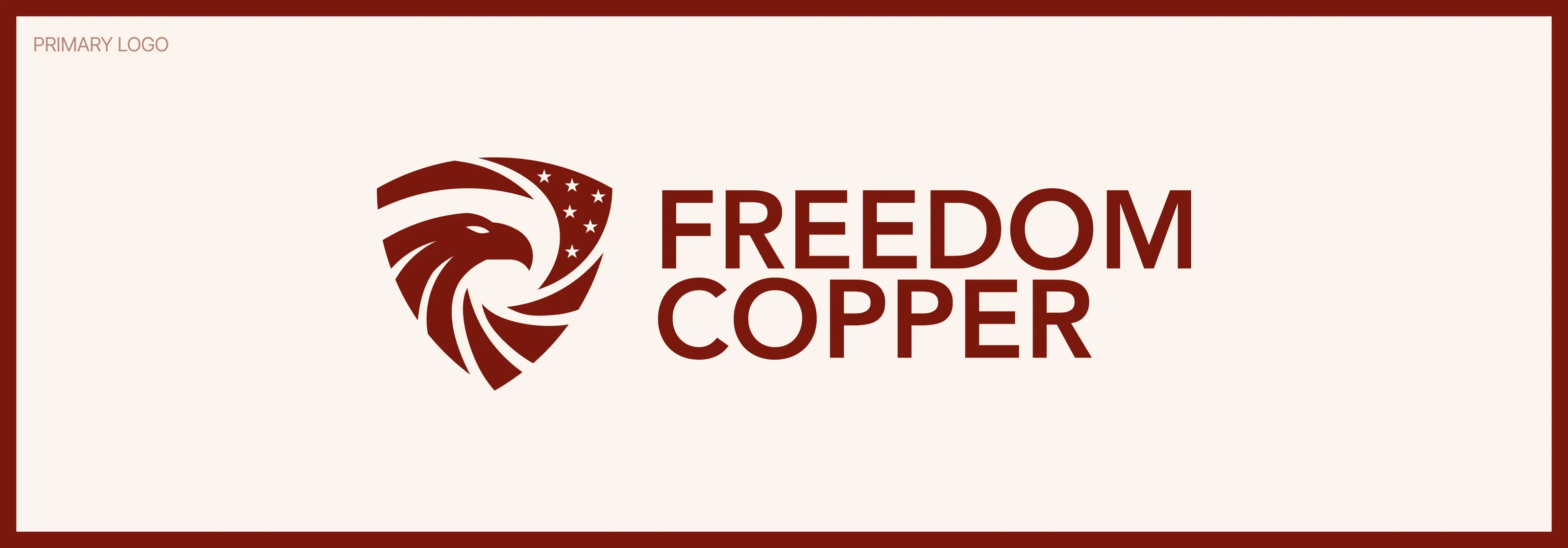
A mark built on movement and possibility.
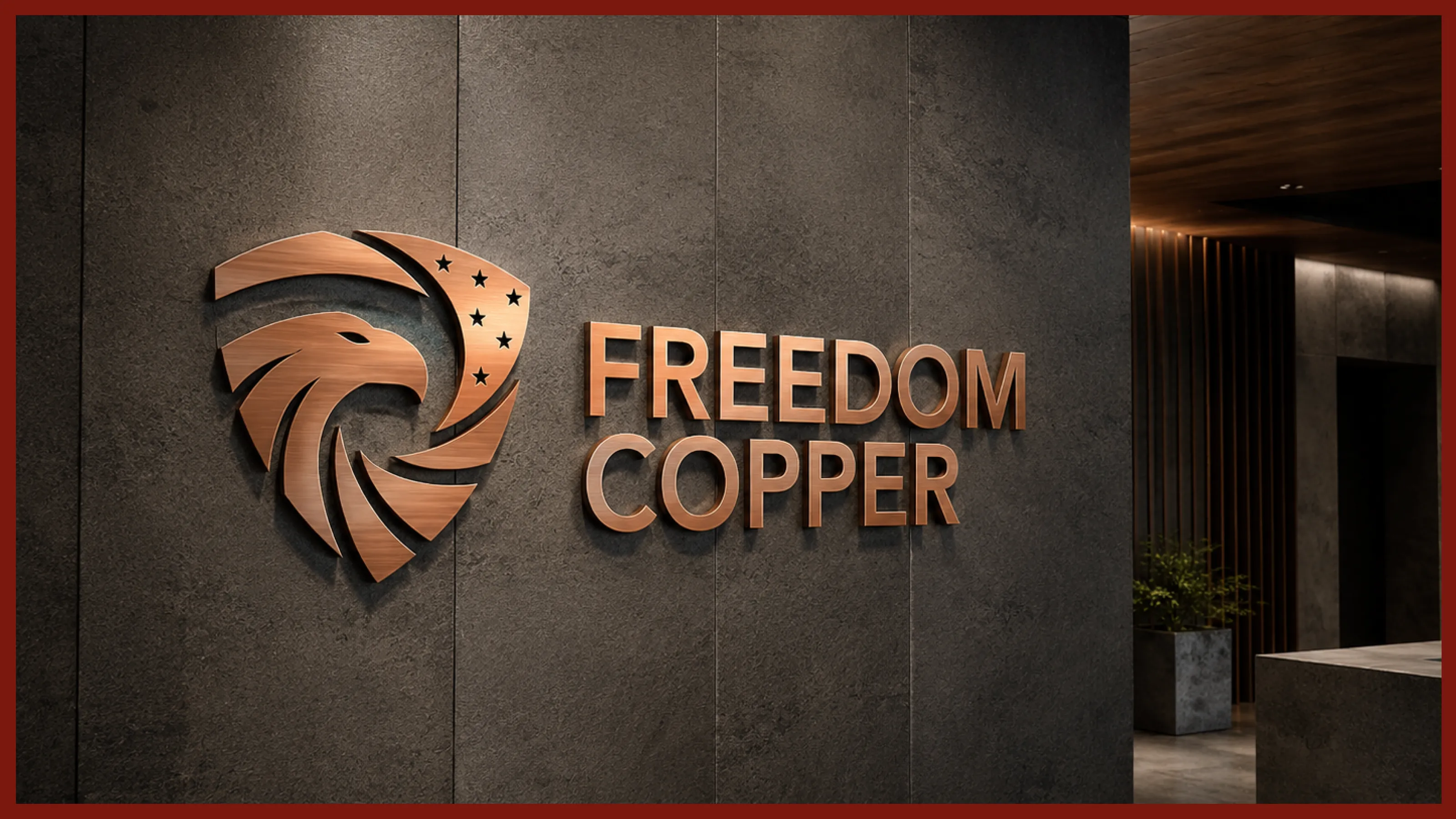
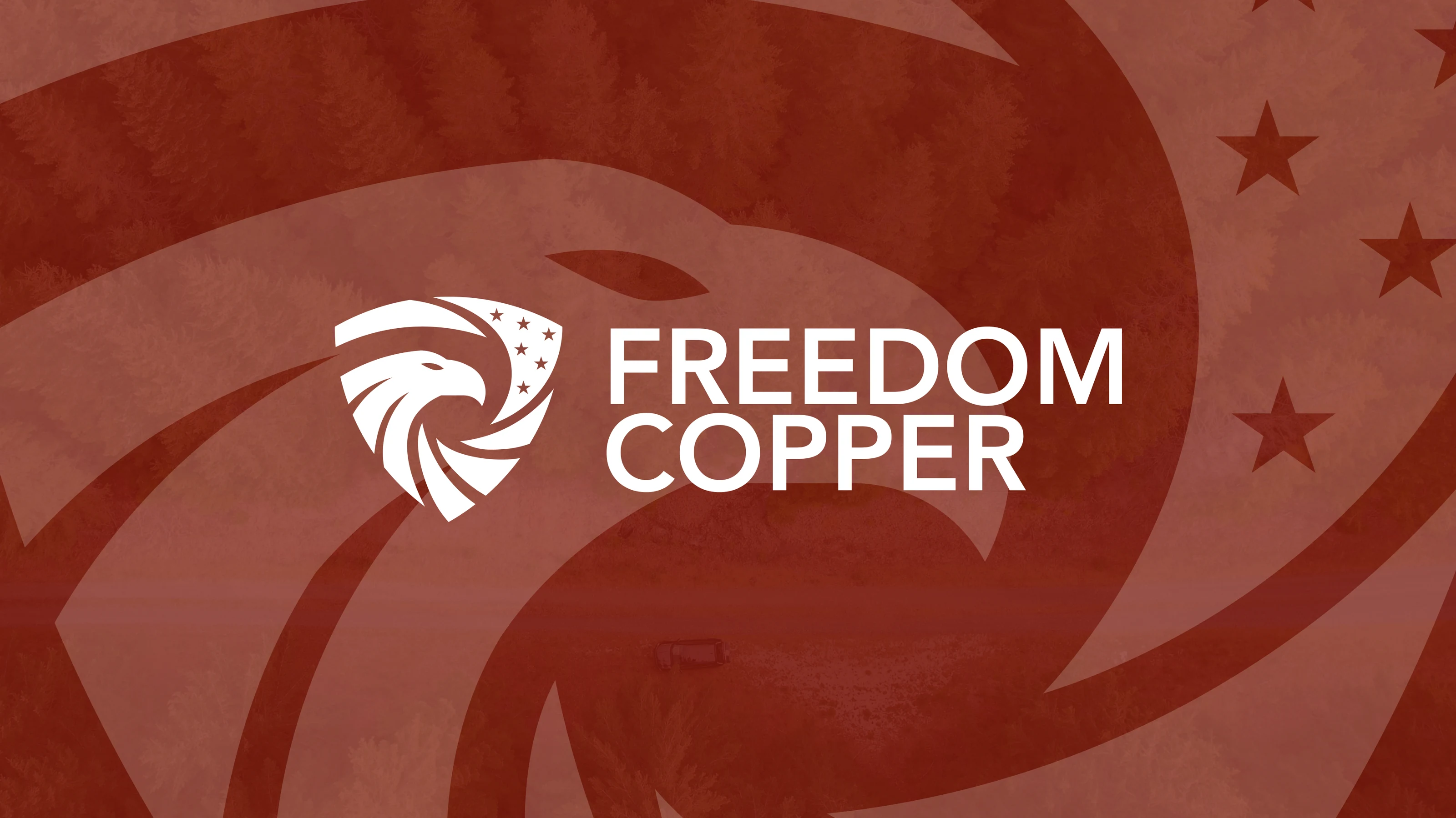
The Freedom Copper identity was developed to feel simple, recognizable and symbolic without becoming literal.
The mark draws from ideas of land, horizon, emergence and forward movement, creating a visual expression of something valuable being uncovered and brought into possibility.
Rather than relying on mountains, pickaxes or obvious copper symbolism, we created a mark that could stand confidently on its own.
Distinctive enough to be remembered.
Simple enough to be used everywhere.
(02) The Brand System
One feeling.
Expressed consistently.
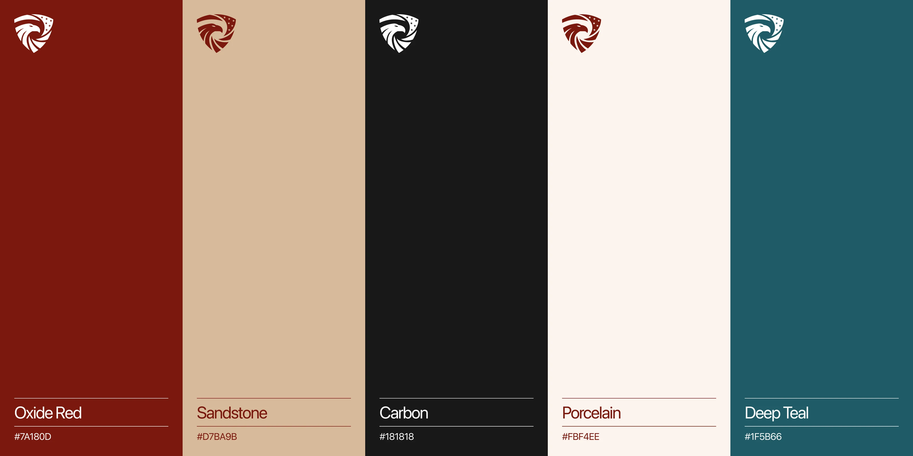
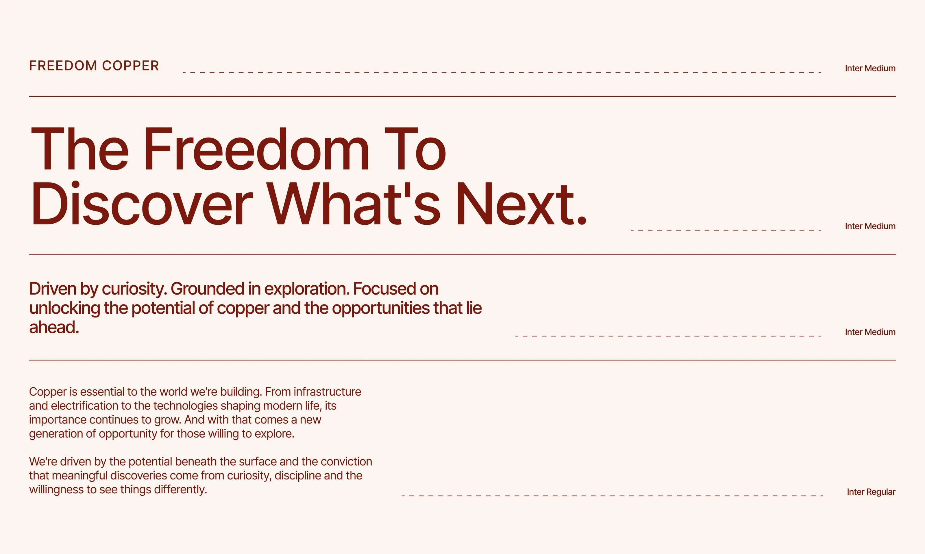
The identity became the foundation for a complete visual language around Freedom Copper. A warm, mineral-inspired colour palette connects the brand back to copper and the earth, while typography, graphic structure and supporting visual elements give it a more contemporary corporate presence.
The system brings together:
Logo and brand mark
Typography
Colour palette
Graphic language
Photography direction
Layout and hierarchy
Core brand applications
Each element was designed to reinforce the same idea, creating a brand that feels cohesive whether it appears on an investor presentation, project material, corporate communication or digital platform.
(03) Visual Identity Design
Making every
element count.
We translated the strategy into a distinctive visual identity, bringing together a considered symbol, refined typography, and a palette inspired by copper and the earth.
Every detail was designed to balance strength with sophistication, creating a recognizable identity that moves beyond the conventions of the mining industry.
(04) Brand Application System
One identity.
Endless applications.
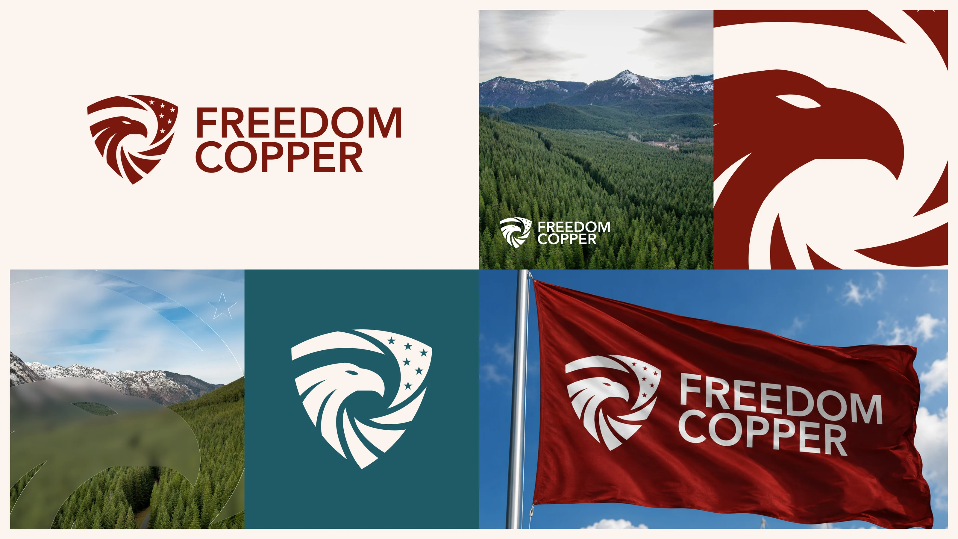
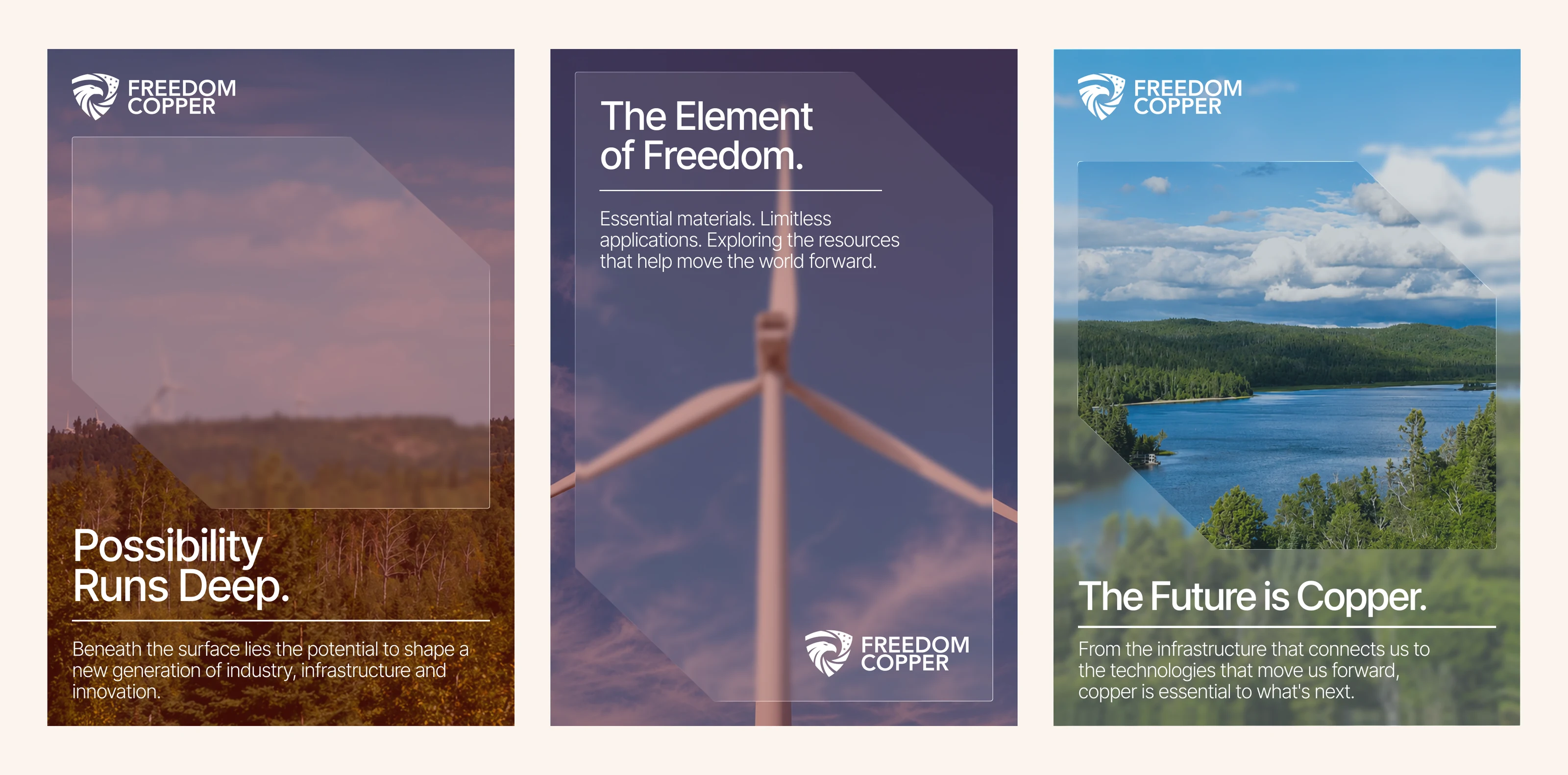
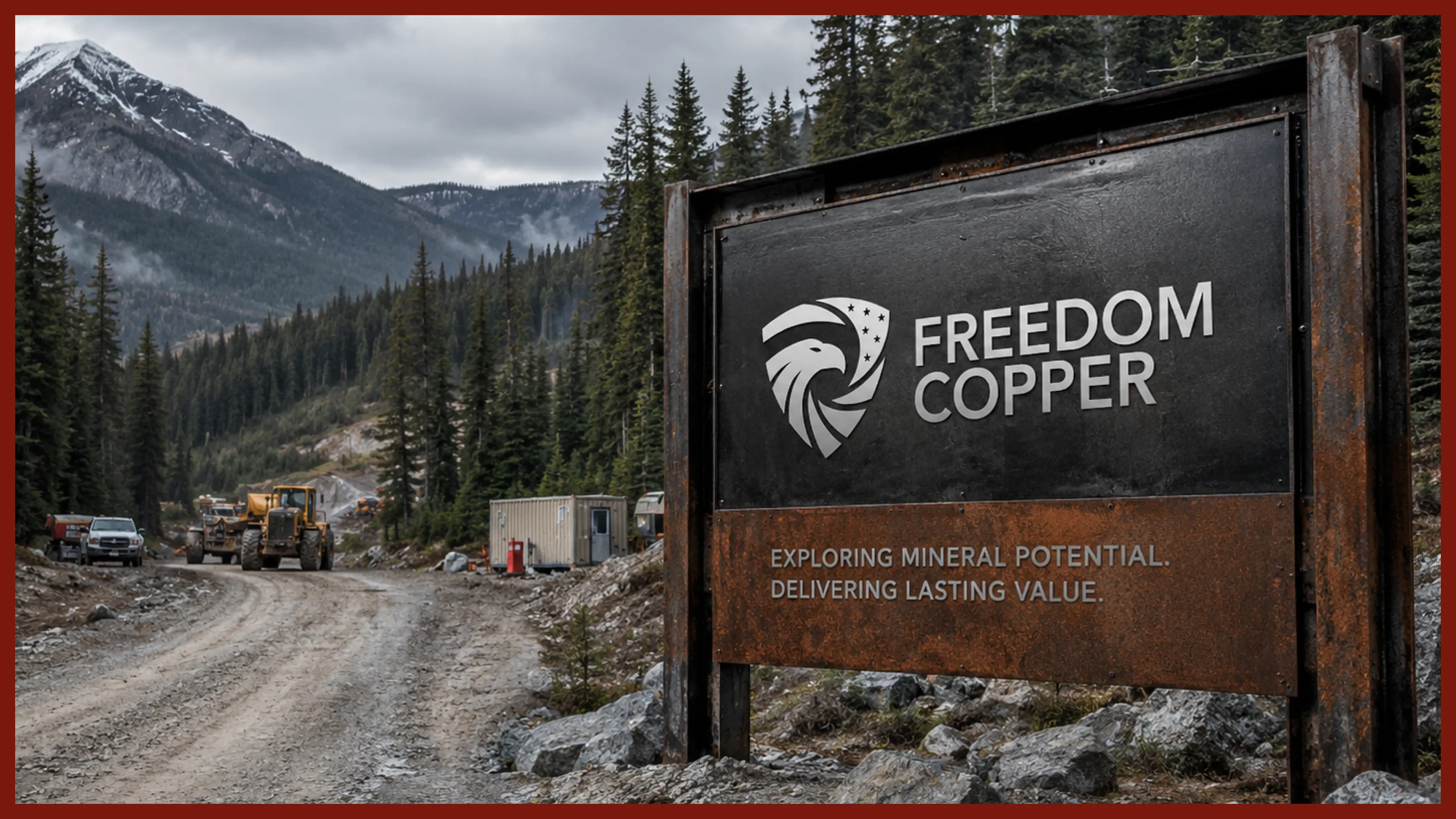
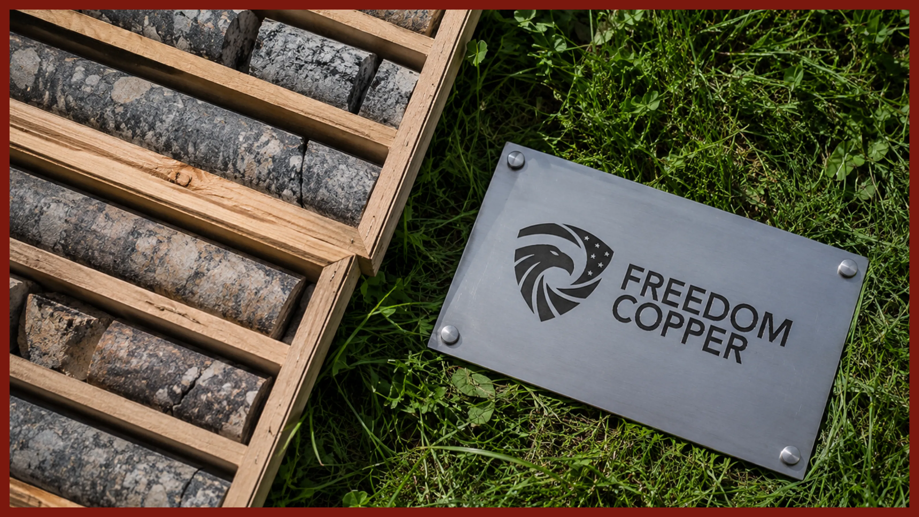
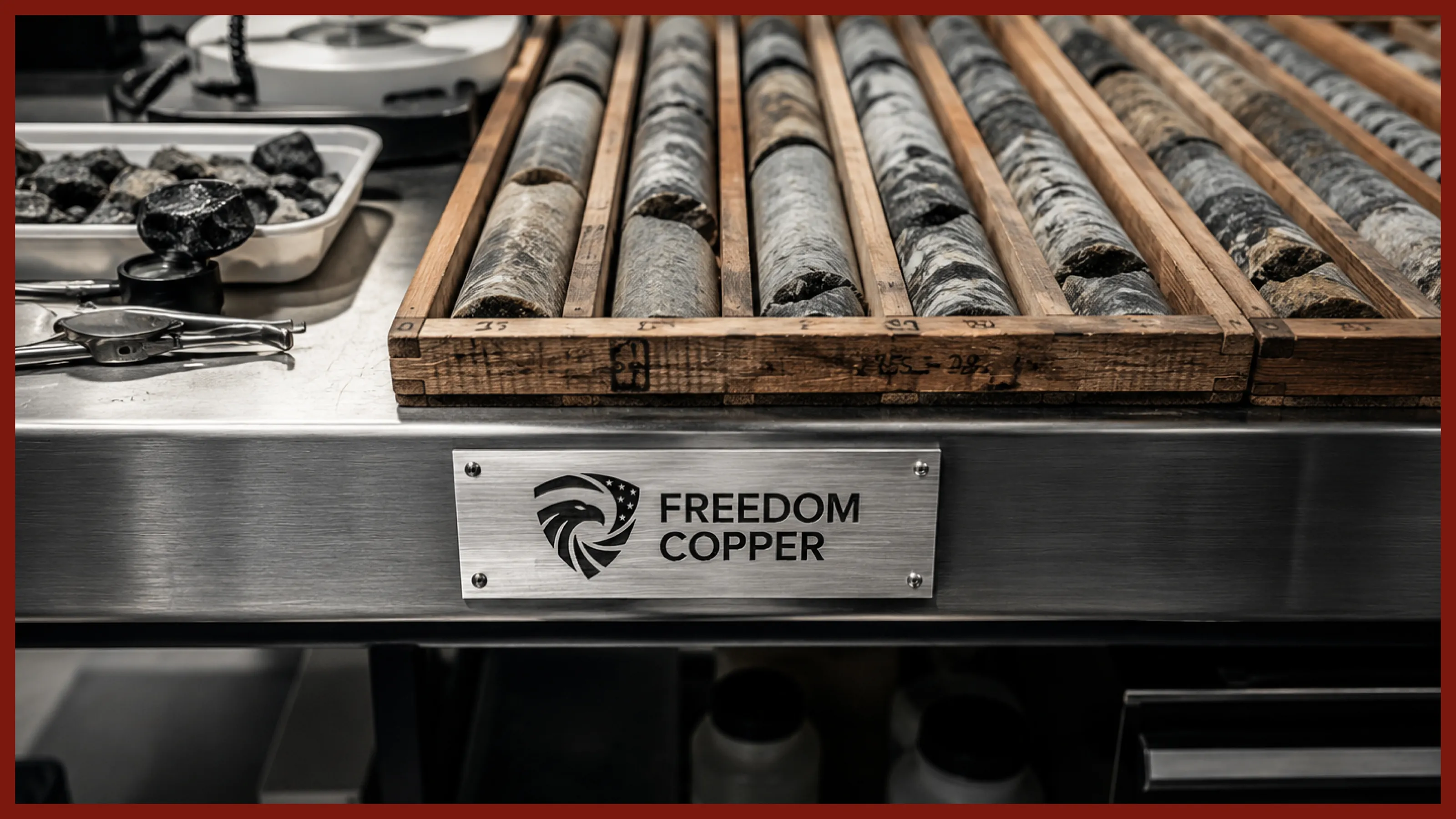
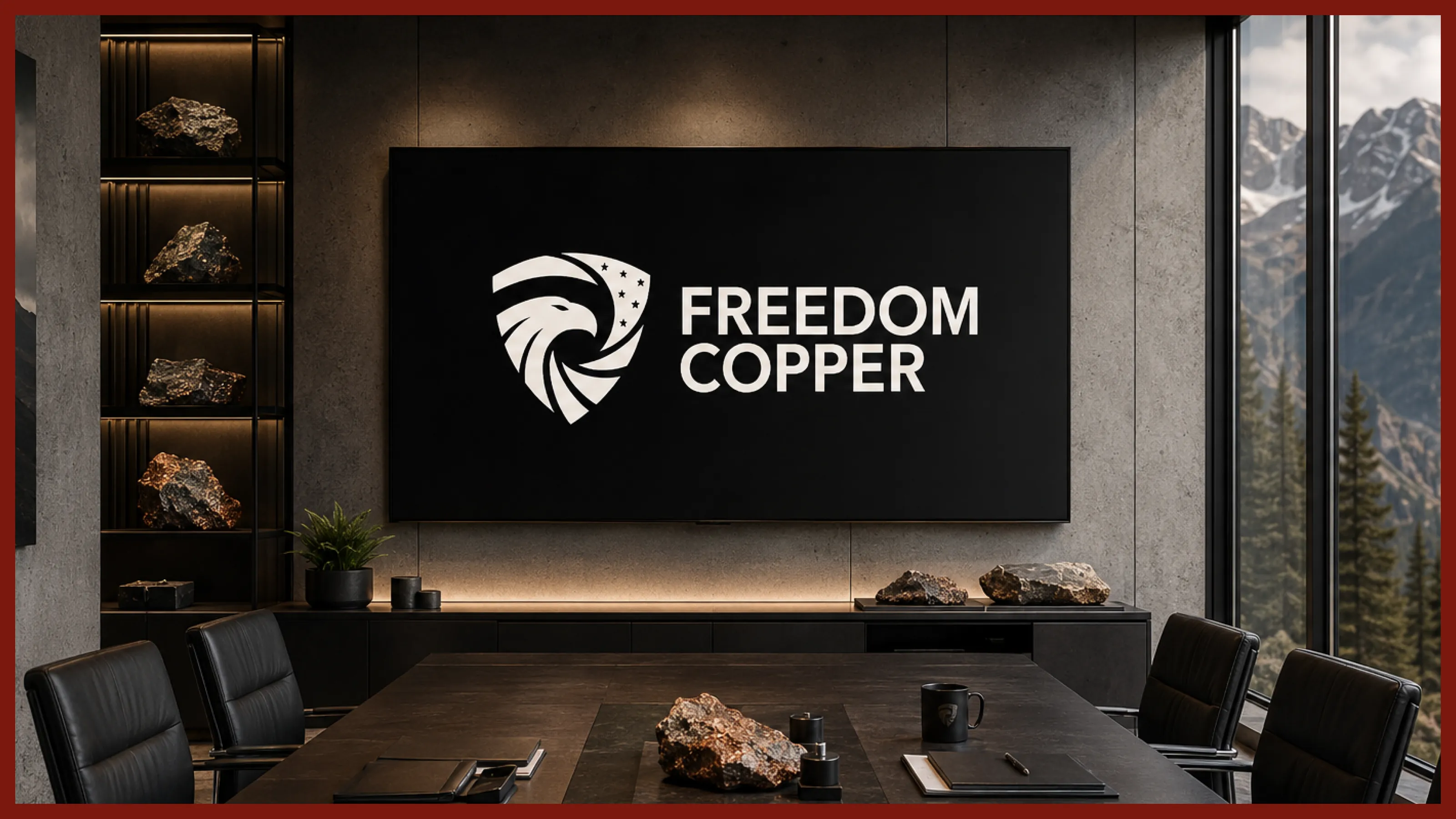
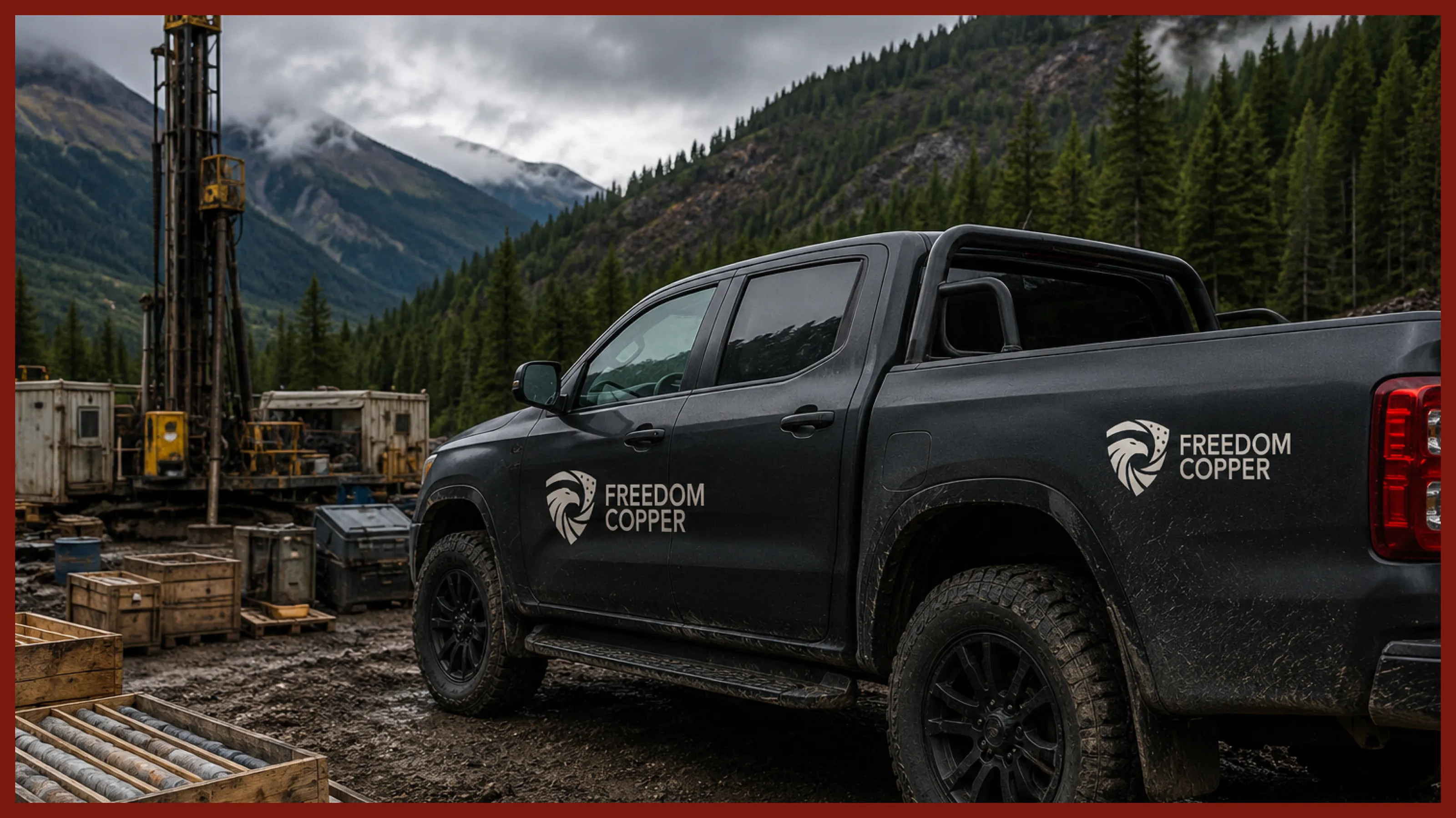
We built a cohesive visual system designed to bring Freedom Copper’s story to life across every touchpoint it will interact with.
From investor presentations and corporate communications to digital experiences and project storytelling, the system provides the consistency to build recognition and the flexibility to grow with the company.
What’s Next?
Your brand, story, and ambition deserve to be represented at their best.
Great companies deserve more than great design.
We bring strategy, story, brand and digital together to make your business easier to understand, recognize and choose.
If you have a project, let’s chat.
 Next projectBlack Pine
START A CONVERSATION
Your ambition deserves a brand that can carry it.
Whether you’re building something new, redefining your position or taking your business into its next chapter, we bring the strategy, creativity and technology to help make it happen.
It starts with a conversation.
Tell us what you’re working toward and what you’re looking to create. We’ll take it from there.