The Fontenay
How a mid-century building on the Humber River got an identity that behaves like an address, not an advertisement.
- Client
- The Fontenay
- Services
- Brand Strategy, Brand Identity, Web & Digital
Overview
A building with genuine mid-century bones, marketed as though it had none.
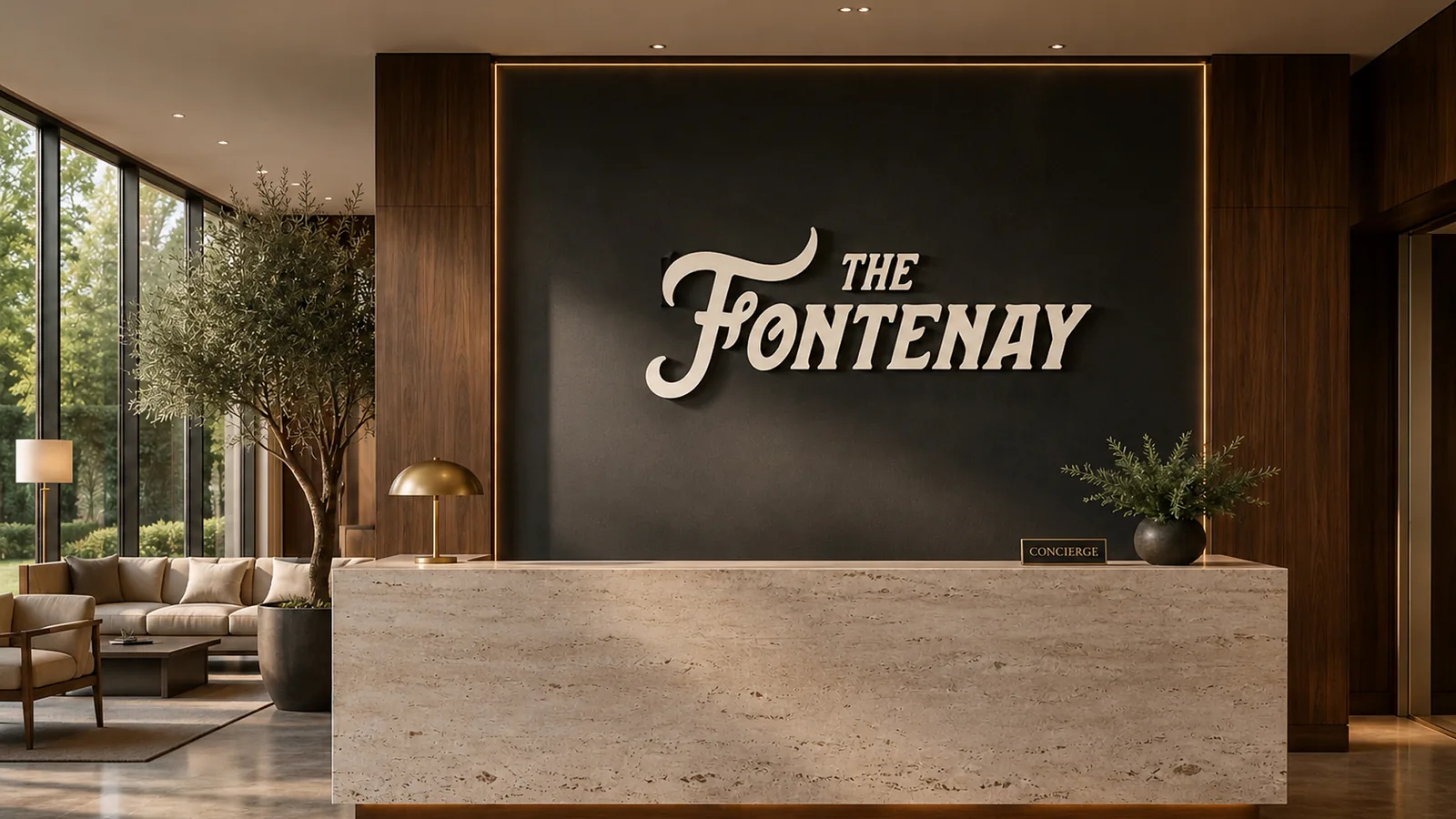
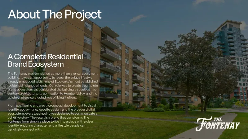
The Fontenay sits above the Humber River with the proportions, materials and calm of the period that produced it. What it did not have was a way of saying so. The identity was a typeface applied to a name, the signage had accumulated rather than been designed, and the leasing material described amenities in the same words every other building in the city uses.
The brief was not to make the building look new. It was to make the building look like itself — to give a resident, a broker and a passer-by the same impression from three completely different surfaces.
That meant treating the identity as environmental first and marketing second: what the monument sign at the entrance says has to agree with what the lobby wall says, which has to agree with what the website says at two in the morning.
The claim & cover system
Approach
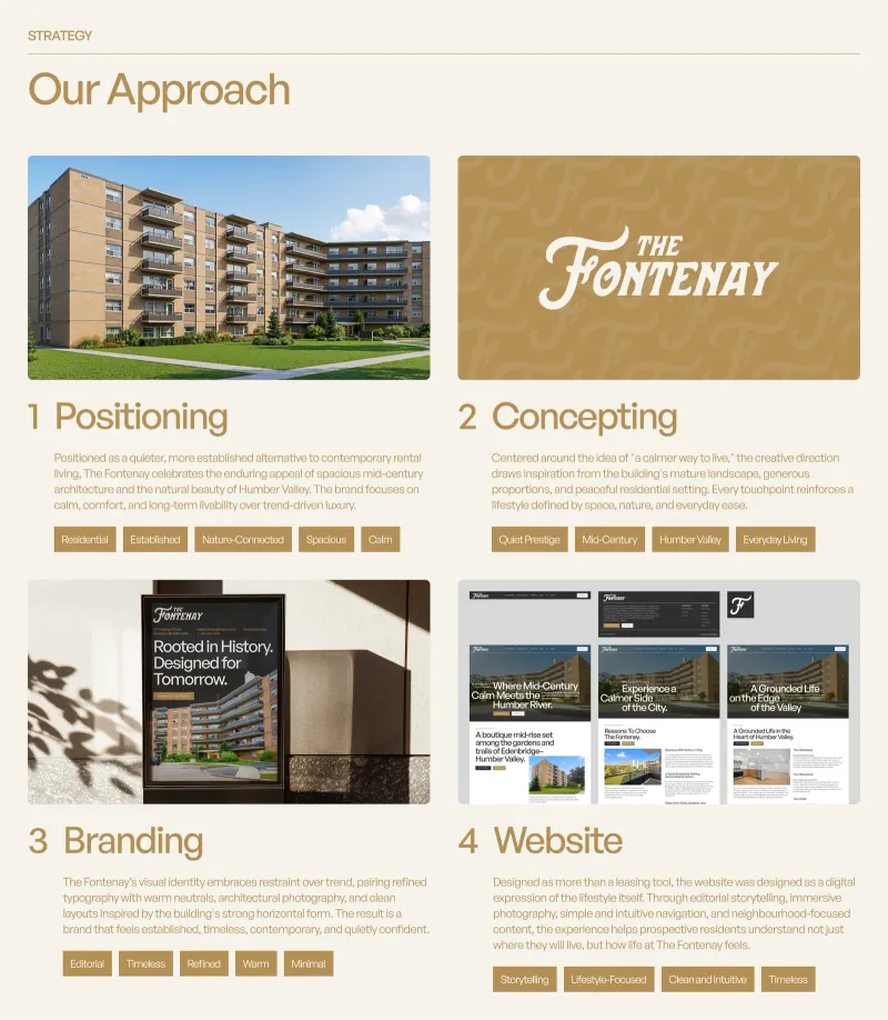
Positioning, concepting, branding, website — in that order, without exception.
Property work fails when the signage is ordered before the position is agreed. We ran the sequence properly: what this address is for, then what it looks like, then where it appears, then how it converts.
- PositioningWhat this address is for, and who it is for — agreed in the room before anything was drawn.
- ConceptingDirections explored against the building itself: its period, its proportions and its setting on the river.
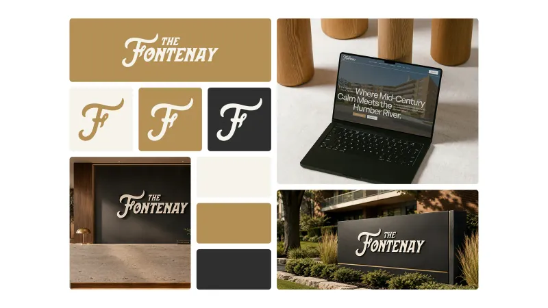
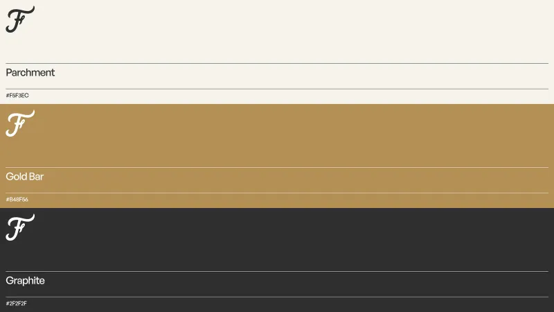
- BrandingThe monogram, palette and type system, documented for fabrication as well as for screen.
- WebsiteThe system applied to the surface a prospective resident reaches first, and reaches alone.
The project
Approach board
Identity
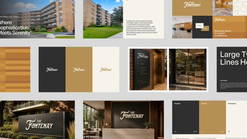
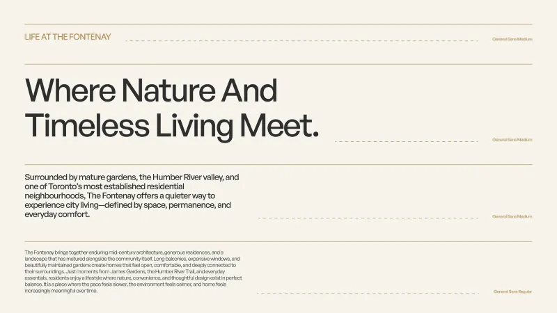
A monogram that works cast in metal and rendered at sixteen pixels.
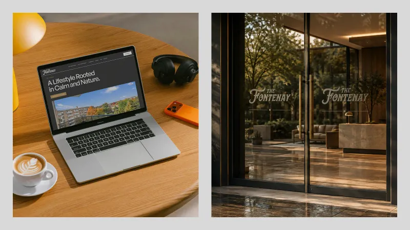
The F monogram was drawn to survive fabrication. It is cut, cast and etched across the building — as a monument sign in the garden bed, a directory plaque on brick, and an etched line on the glass entrance doors — so it had to hold at architectural scale without becoming a logo pretending to be architecture.
Mark & grid
Type & colour system
Applications
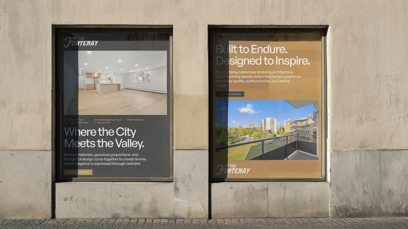
Print, posters and the surfaces people actually stand in front of.
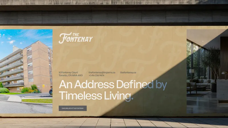
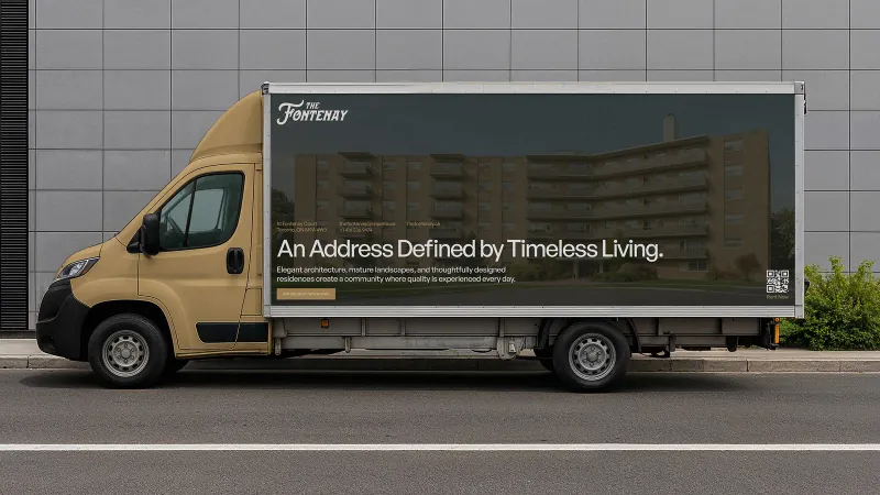
The applied system runs from the framed statements in the lobby alcoves to street-facing window posters, hoarding during works, and vehicle livery — each one carrying a single line rather than a list of features.
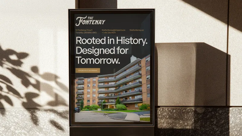
Print & posters
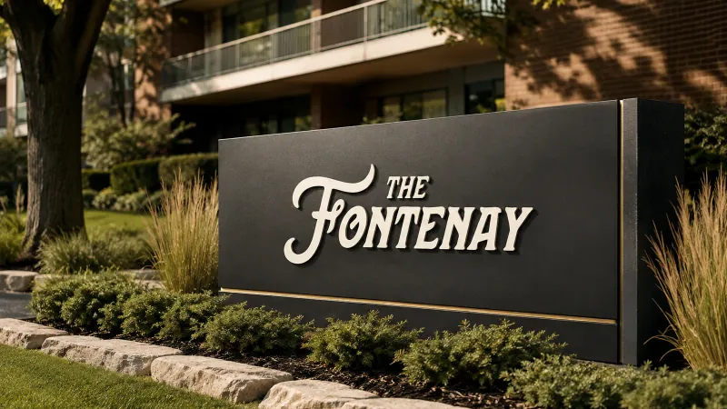
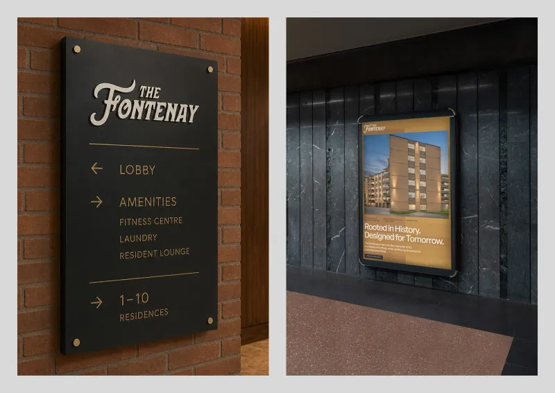
Signage & wayfinding
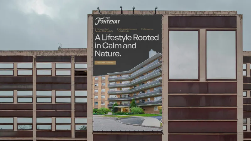
In the neighbourhood
The website
The building, at two in the morning, without a leasing agent.
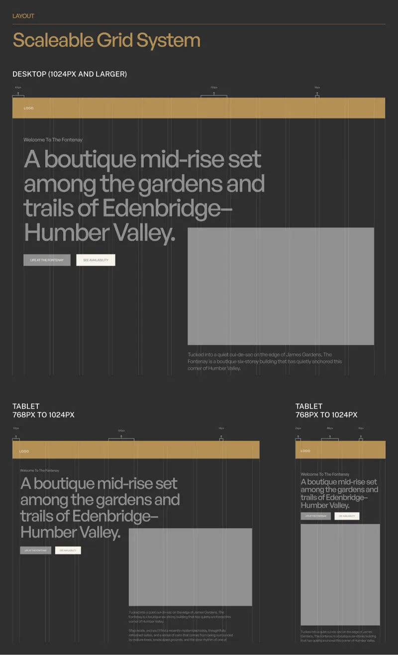
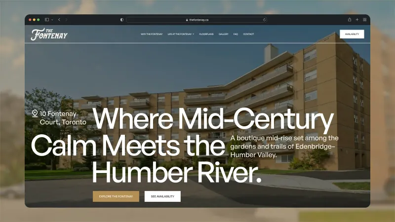
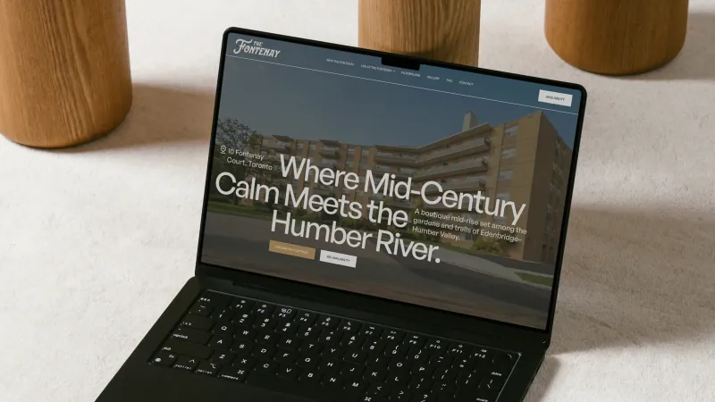
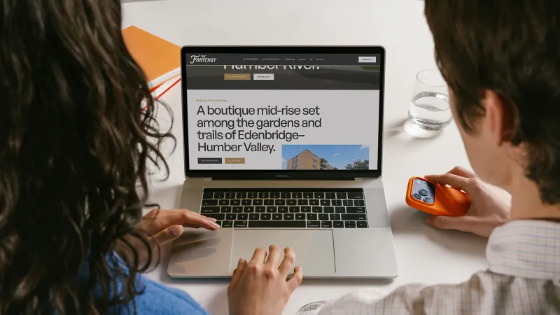
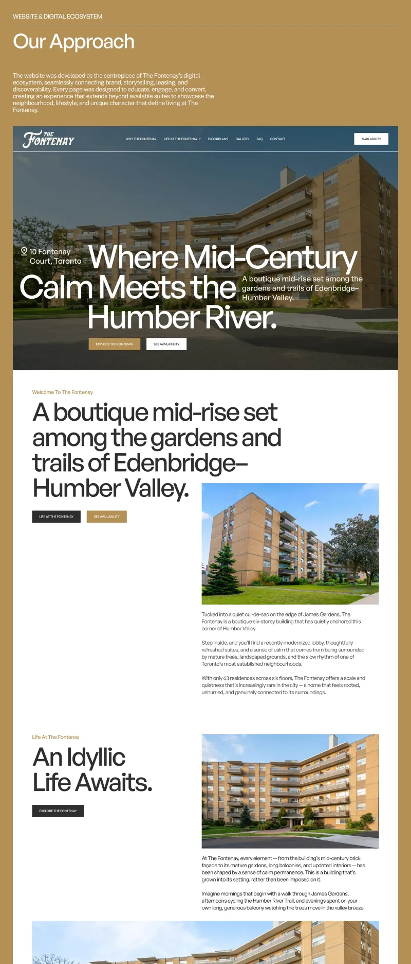
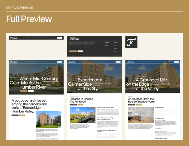
The site opens where the building does — the river, the calm, the proportions — and answers the questions a prospective resident actually arrives with before it asks for anything in return.
The website
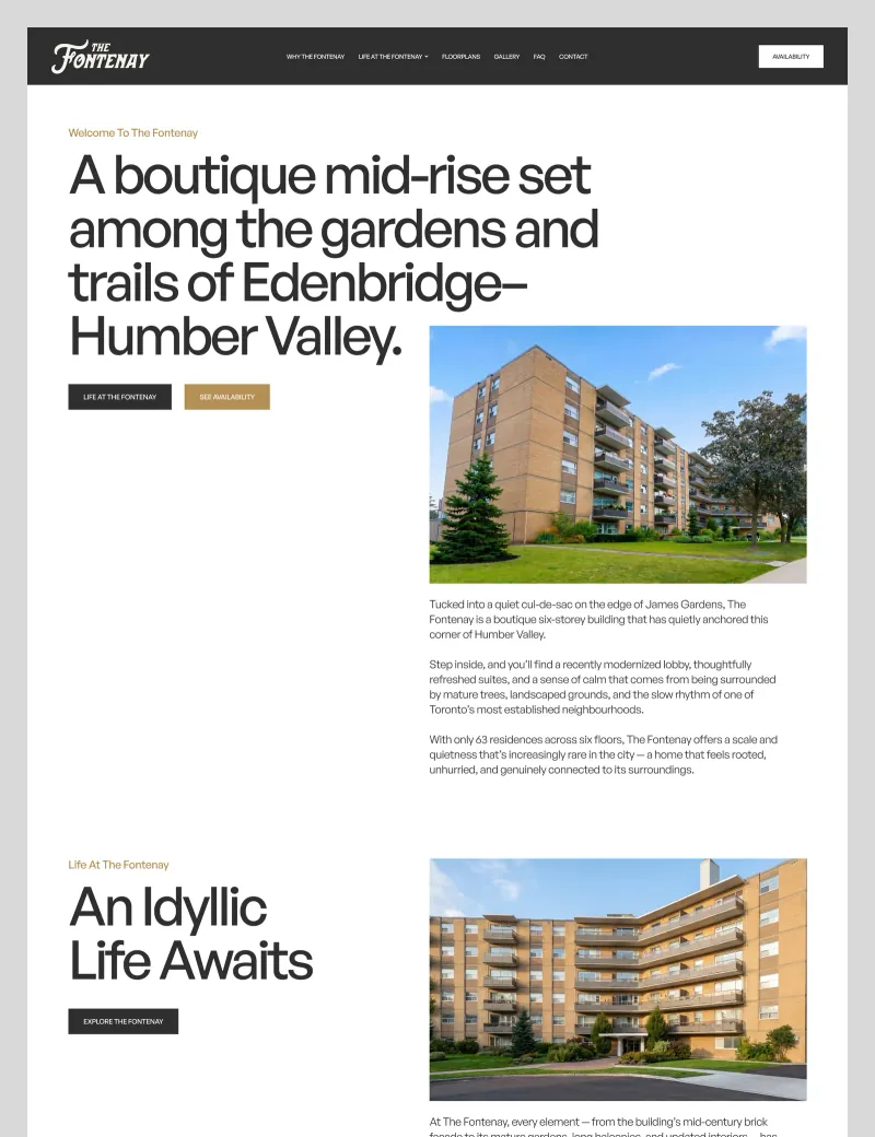
Full page renders
Outcome
One address, one voice, from the garden bed to the browser.
The building now reads as one address from every direction — the monument sign, the lobby wall, the hoarding and the homepage all carry the same line in the same voice. The system was documented for fabricators and for the building team, so the next plaque and the next page arrive correct without a designer in the loop.
 Next projectThe Line
START A CONVERSATION
Your ambition deserves a brand that can carry it.
Whether you’re building something new, redefining your position or taking your business into its next chapter, we bring the strategy, creativity and technology to help make it happen.
It starts with a conversation.
Tell us what you’re working toward and what you’re looking to create. We’ll take it from there.