Beachflats
How a building got a name people say out loud, and a system that carries it from the boardwalk to the browser.
- Client
- Beachflats
- Services
- Brand Strategy, Brand Identity, Web & Digital
Overview
The naming brief that most developments get wrong: invent a word, or use the one people already say.
Buildings in this neighbourhood are routinely given names borrowed from somewhere else entirely — a European street, an invented surname, a compound of two pleasant syllables. They test well in a boardroom and die on the street, because nobody who lives there ever repeats them.
Beachflats went the other way. The name is built from how residents already describe the area and the building type — flats, at the beach — so it needed no explanation, no story to justify it, and no pronunciation guide on the hoarding.
From there the work was to make everything else behave as plainly as the name: a mark that reads at a glance, a palette taken from the actual shoreline, and a website that answers the question a buyer is really asking, which is what it feels like to live there.
The claim & cover system
Approach
Positioning, concepting, branding, website — the name settled first.
Naming came before identity and identity before the site, which is the only order that avoids drawing a mark for a name that changes in week six.
- PositioningWho the building is for, and the plainest true thing that can be said about living there.
- ConceptingNaming routes tested against how people already talk about the neighbourhood, not against a boardroom.
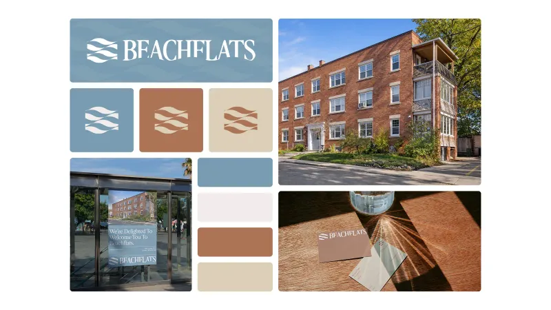
- BrandingThe wave monogram, the shoreline palette and a two-typeface system documented end to end.
- WebsiteThe life first, the floorplate second — with templates the team can extend themselves.
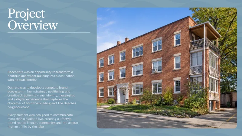
Project overview
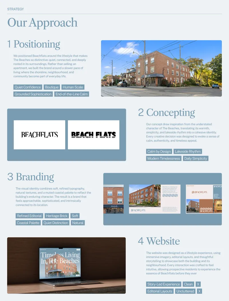
Approach board
Identity
A wave that works cast in metal, printed on a card, and scaled to a favicon.
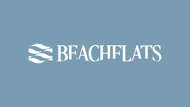
The wave monogram is a single continuous form — enough to read as water at a distance, simple enough to be fabricated as a dimensional sign and engraved as a metal plaque without losing its line.
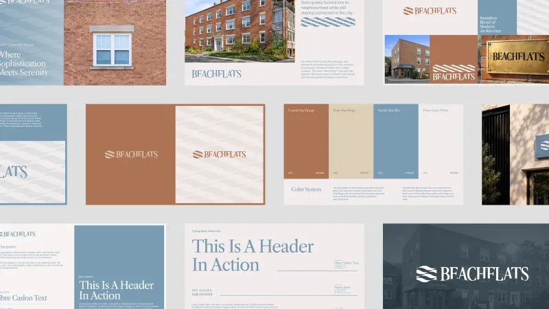
Mark & grid
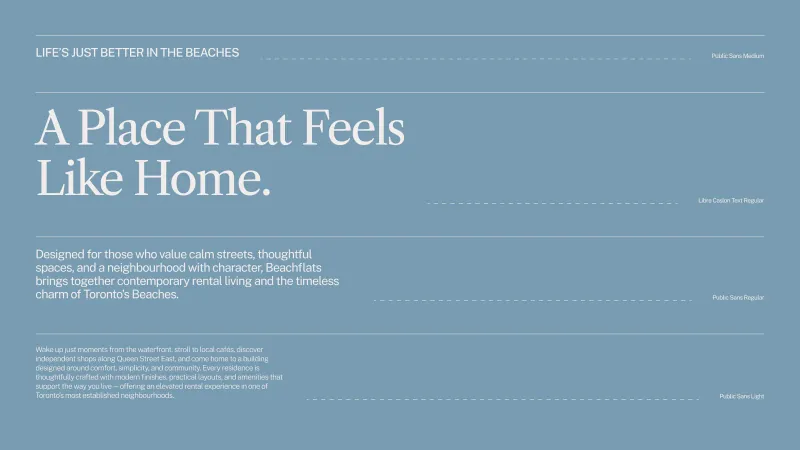
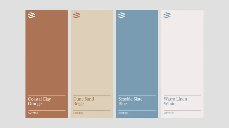
Type & colour system
Applications
Cards, posters, transit and a tote — the things that leave the building.
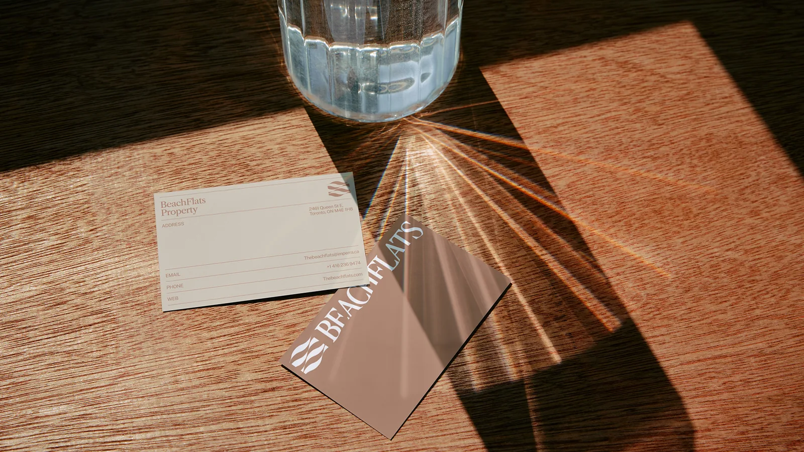
The business card system runs across four colourways so the team can hand over something that matches the context rather than a single locked artwork.
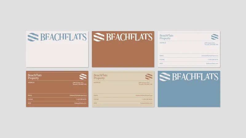
Stationery
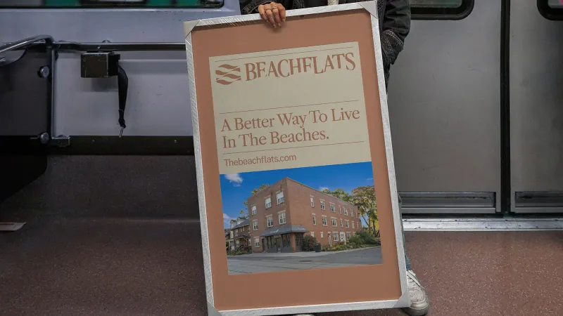
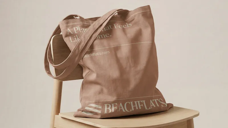
Print & transit
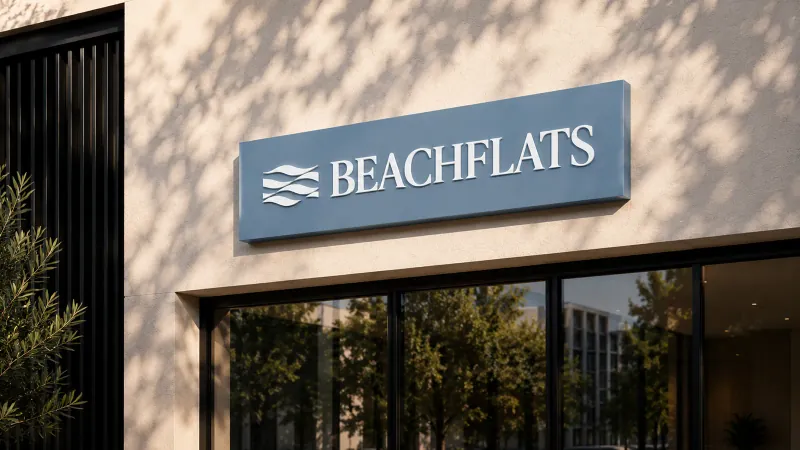
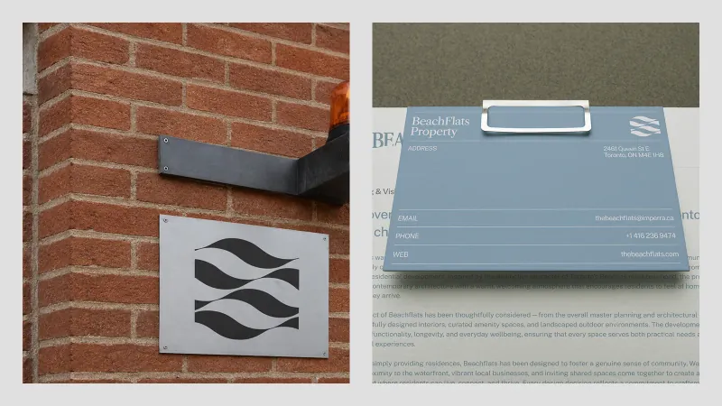
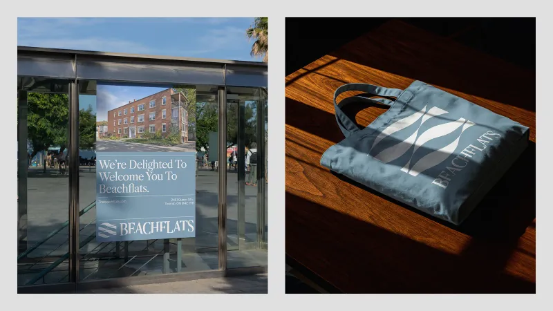
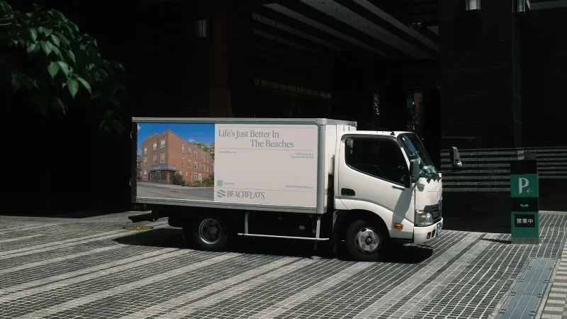
Signage & environment
The website
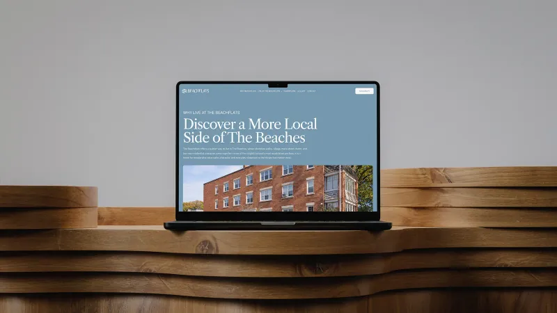
A site that sells the life, then the floorplate.
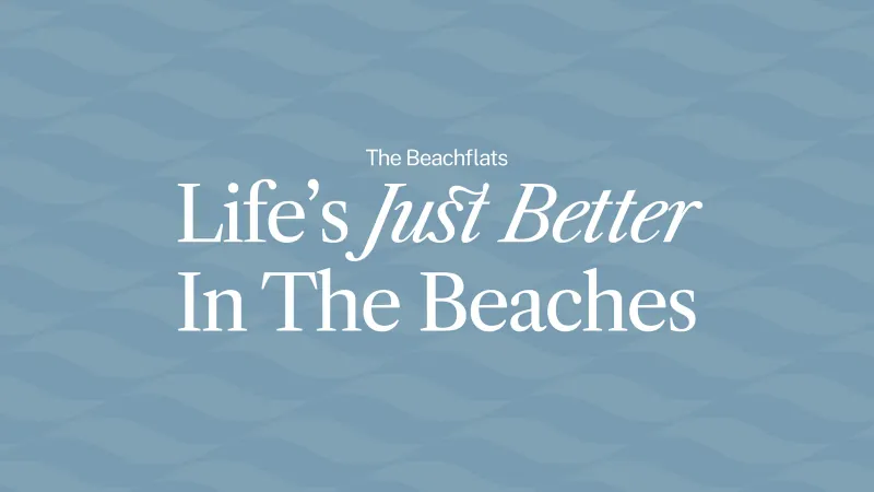
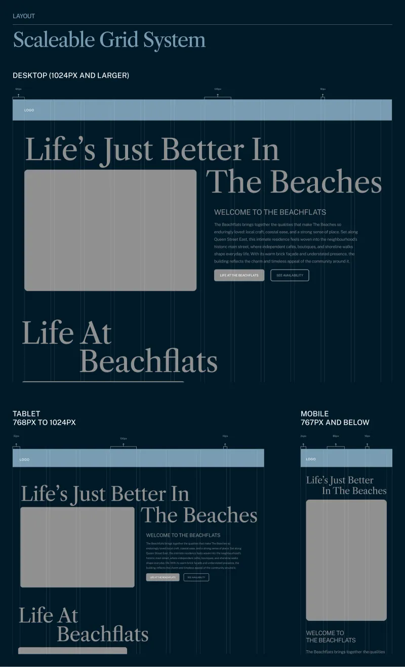
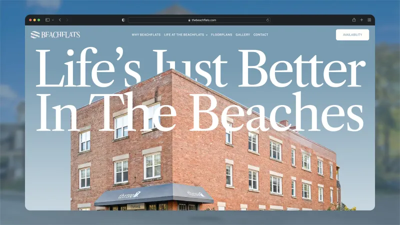
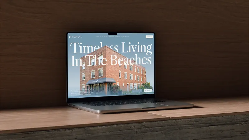
The homepage leads on the neighbourhood and the feeling — life's just better in the Beaches — and only then moves to the specifics a serious buyer needs.
The website
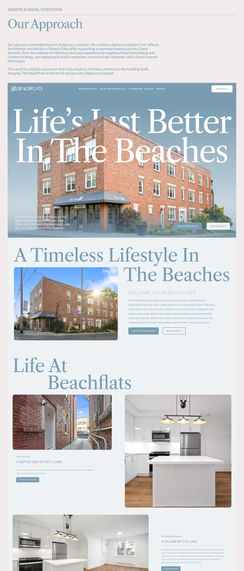
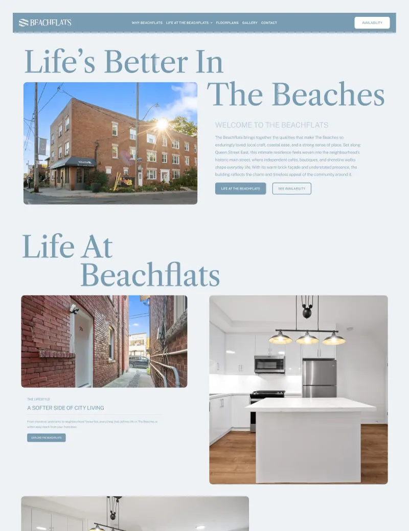
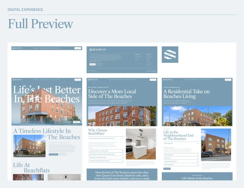
Full page renders
Outcome
Named, signed and launched as one system.
The development launched with the name, the signage and the site arriving as one system rather than three separate approvals. The identity was documented for fabricators and the site handed over with templates, so the team can keep publishing without the brand drifting.
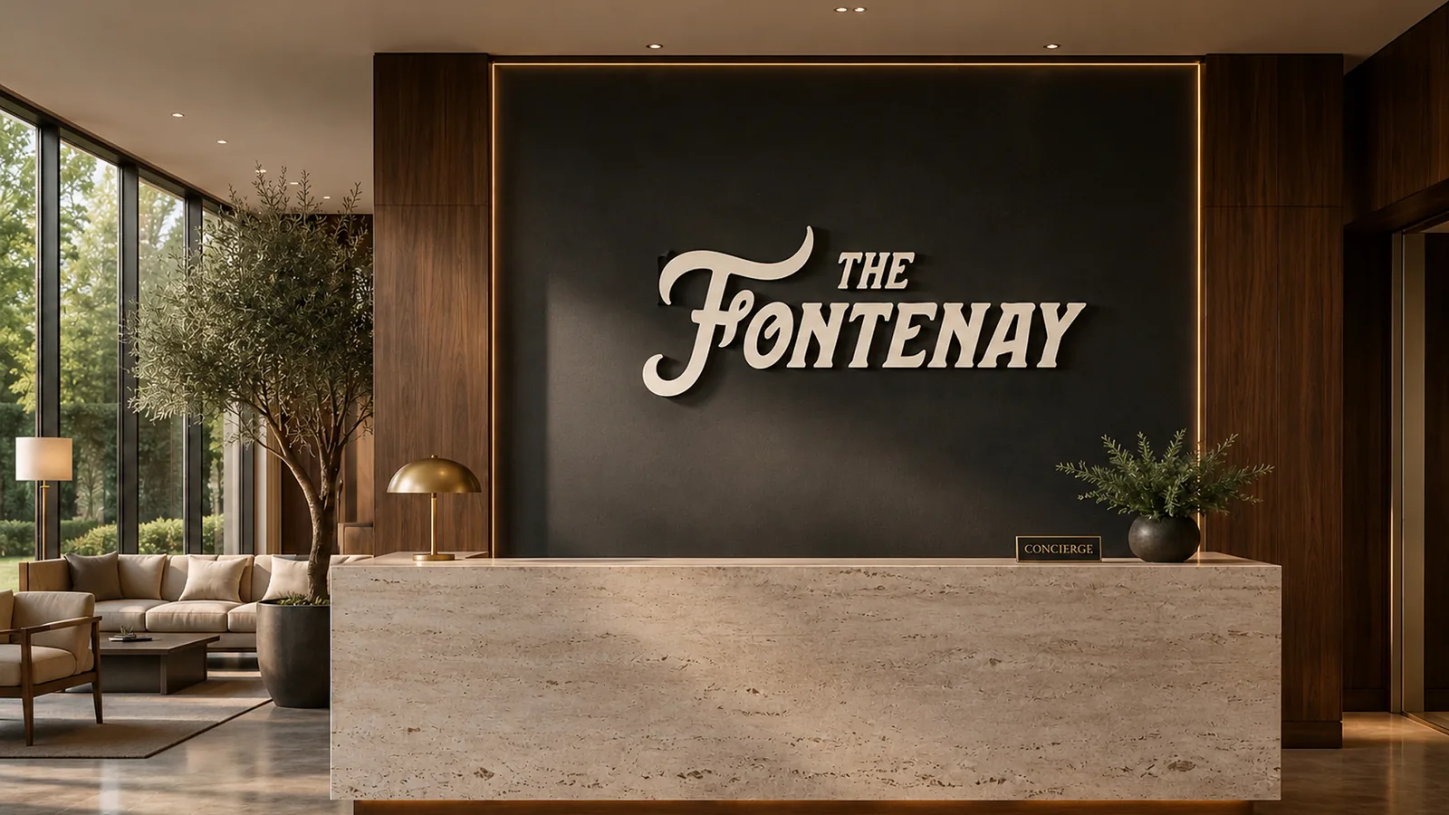 Next projectThe Fontenay
START A CONVERSATION
Your ambition deserves a brand that can carry it.
Whether you’re building something new, redefining your position or taking your business into its next chapter, we bring the strategy, creativity and technology to help make it happen.
It starts with a conversation.
Tell us what you’re working toward and what you’re looking to create. We’ll take it from there.